tableau Dashboard:
Real Estate Marketing
Project Summary:
This interactive Tableau dashboard was created to support a real estate investment platform seeking to expand their marketing reach. The company had collected public buyer data for properties purchased in Indianapolis between January and August 2023, and needed a clear visualization of where those buyers were located. Their end goal was to identify which cities and states to prioritize for future marketing campaigns.
By mapping the geographic distribution of past buyers, this dashboard helps uncover high-interest regions, both within Indiana and across the U.S., allowing the company to target their future advertising toward potential clients most likely to use their platform. Scroll to the bottom to interact with the dashboard on my website.
key insights
Summary of Analysis:
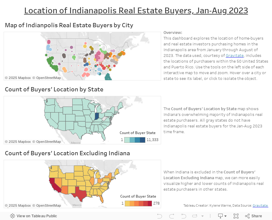
The highest number of property purchases came from within Indiana, but a significant share originated from out-of-state buyers, highlighting strong external interest in Indianapolis real estate.
Cities within Indiana like Carmel, Fishers, and Greenwood consistently ranked high in buyer volume, while outside of Indiana, cities such as Chicago, New York, and Los Angeles showed notable activity.
Buyers from neighboring Midwest states made up a substantial portion of out-of-state purchases, suggesting a regional interest that can be further tapped.
Some distant markets (e.g., California and Florida) also showed a surprising level of activity, indicating potential for broader digital outreach campaigns.
Recommendations:
The first marketing priority should continue to be Indiana, specifically around Indianapolis and North West Indiana.
Second marketing priority should be California, Texas, and Arizona, specifically around Scottsdale, Houston, Los Angeles, and the Bay Area.
Third marketing priority should be the states of Illinois, Florida, New York, Nevada, and Ohio.
If operating on limited marketing resources, concentrate on these geographic regions in this order.
process
Objective:
Create an interactive, geographic visualization for a real estate investment company to identify what cities and states they should advertise their platform to.
Step-by-Step Process:
Publicly available data was imported into Google Sheets for initial exploration. I verified field accuracy, removed duplicates, and ensured location data was consistent and complete.
After determining Tableau Public would be the best visualization tool to use, as it has geographic visualization capabilities, I arranged the dimensions and measures to display all geographic points clearly.
When examining the data, I discovered interesting patterns in the individual cities and states that purchasers were located in. I decided that a multi-table dashboard would be the best way to show viewers the concentration of buyers per city, in Indiana versus outside of Indiana, and highest concentration of buyers per state excluding Indiana. This would allow audiences to see all of the nuances of data.
The multi-table dashboard was created to show buyer concentrations by city and state.
Filters and legends were added for ease of interaction and layered analysis.
Scroll down to interact with the dashboard directly on my website, or click the link button to view on my Tableau Public page.